Rose Tattoos: Choosing Black and Grey or Color
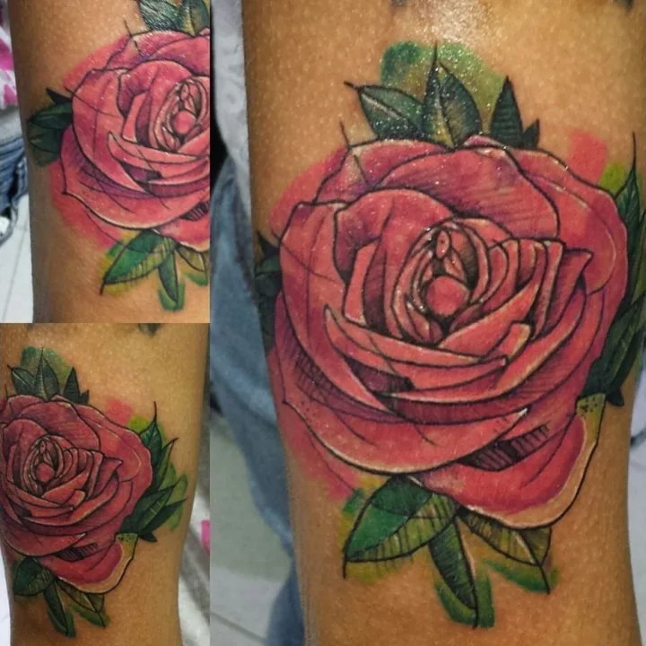
Choose the rose before its color. A tightly framed bloom and a flower on a long stem occupy different spaces, even in the same palette. Once the shape is clear, compare what color or black-and-grey shading would bring to it.
What makes a color rose readable?
Color works with the petal structure, not in place of it. William's Rose study tattoo shows a red bloom with green leaves, photographed from several views. The petal edges and darker areas separate the layers so the flower remains recognizable as a volume.
If you want a specific rose or an unusual palette, bring references. Red does not have to establish a romantic story, and another color does not automatically carry a fixed meaning. Tell the artist what the flower represents to you, if that affects the choices.
How would black and grey change the approach?
Without the red-green distinction, the design relies more heavily on light, shadow and separation between forms. The central petals, outer folds and leaves need clear relationships. A black-and-grey direction is not merely a color photograph with its saturation removed.
William's Rose with flowing stem study lets you follow that longer outline in a drawing. Compare the room given to the flower with the length of the stem. Shading and color can be discussed once you know which proportions you want.
Do you want a bloom or a complete flower?
A bloom concentrates attention in one area. A stem introduces direction and gives the piece a longer outline. Leaves can frame the flower, connect it to nearby work or become distracting if they are added without a role.
At your rose tattoo consultation with William, compare the whole flower at the intended size before settling on the palette.