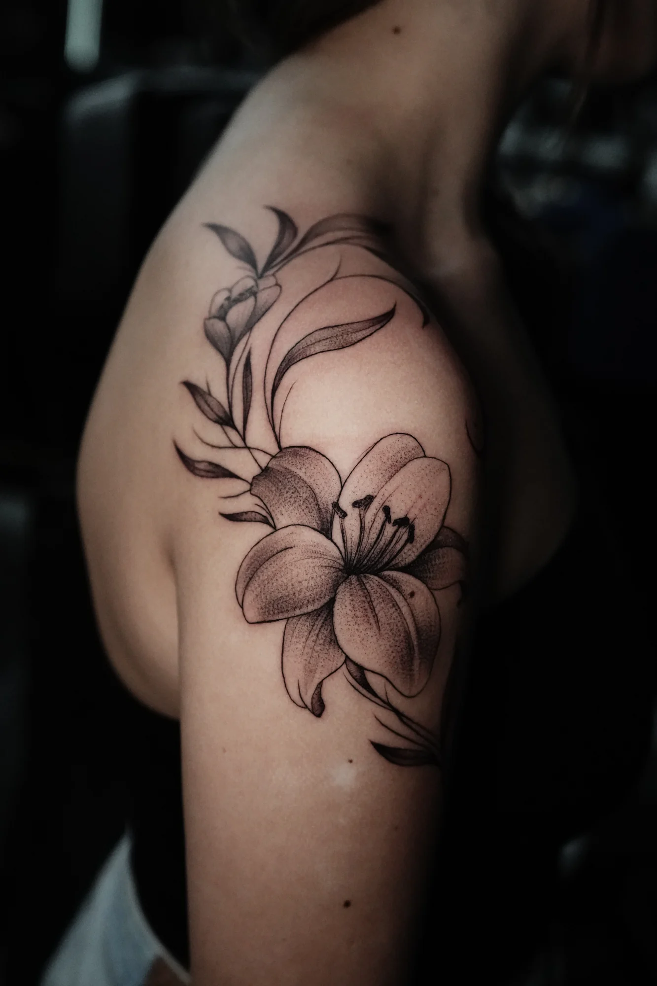
A line describes more than an outline
In a floral tattoo, a line may describe the outside of a petal, a fold within it, or the movement of a stem. Those marks have different jobs even when they are all relatively fine. Treating every edge with the same emphasis would flatten those distinctions.
Floral tide provides a way to look at how an arrangement is held together: individual flower forms belong to a larger direction, rather than sitting as disconnected outlines.
The spaces are part of the drawing
The interval between two lines changes how each can be read. Open skin around a petal separates it from its neighbor; a denser group of marks can describe overlap or shadow. Detail and breathing room work together.
This is why fine line and small are not interchangeable descriptions. One describes a visual quality of the marks. The other describes the scale of the whole piece. A delicate composition may extend over a substantial area.
Simplification is an artistic decision
A drawing does not need to include every visible fold or vein to suggest a flower. Choosing which features carry the subject can create a clearer image than giving every detail equal weight.
That restraint is not the absence of design. It is the design: deciding where a contour continues, where a smaller mark is useful, and where an open passage lets the form remain legible. The effect comes from the arrangement as much as from the thinness of any individual line.