Meaning and silhouette arrive together
A viewer may notice a word’s overall shape before reading it. The width of a line, the direction of the letters and the spaces around them give language a visual presence. The phrase and the drawing are encountered at the same time.
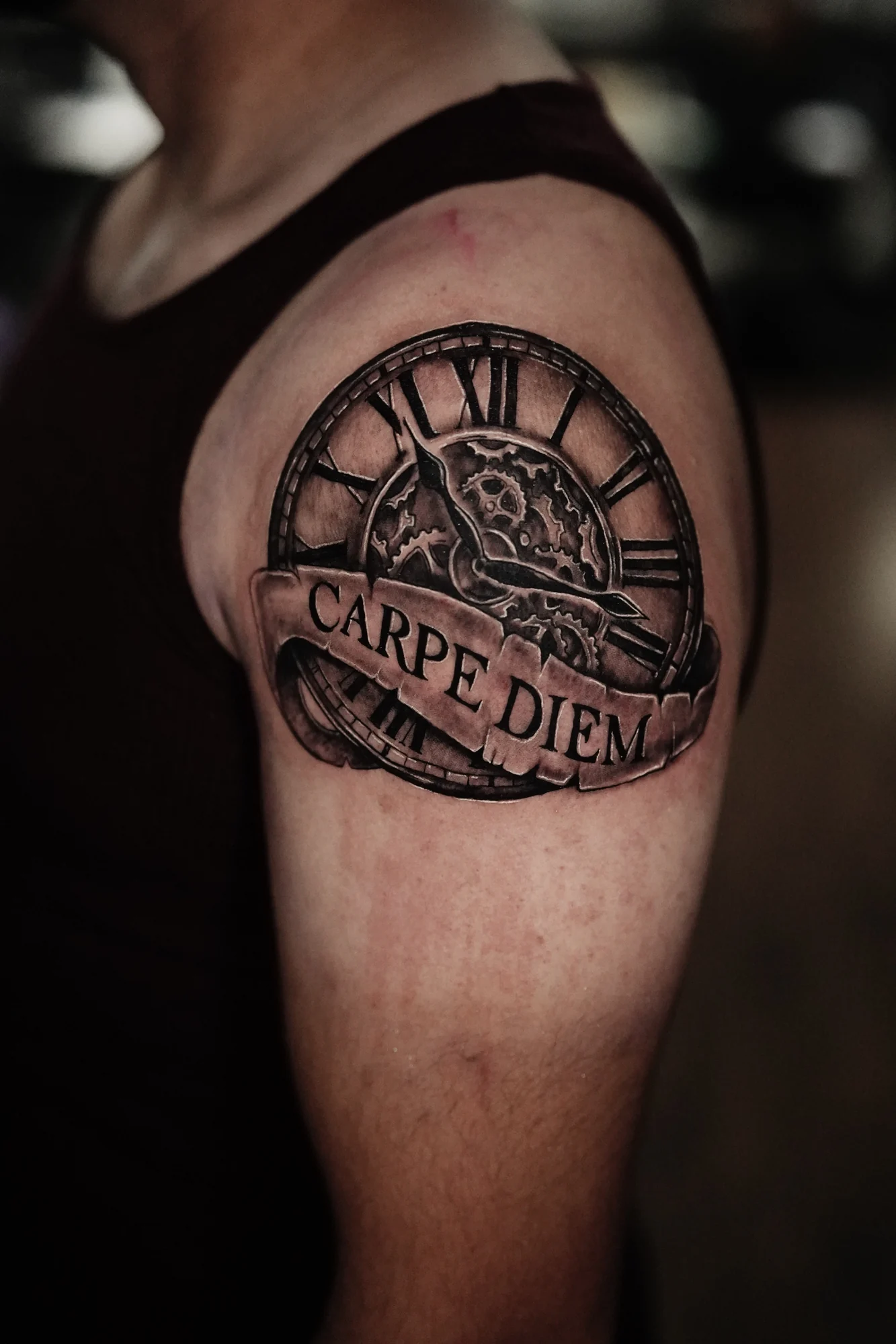
In Carpe diem, the words cross a clock face on a curling banner. The Roman numerals follow the circular edge while the phrase travels across the center. One set of characters belongs to the clock; the other becomes the image’s foreground.
Space changes the rhythm of a phrase
The spaces inside and between letters contribute to legibility, but they also create rhythm. A compact word has a different visual weight from a phrase that spreads across an area. A flourish can extend that movement, while a firm ending can bring it to a stop.
These decisions belong to composition as much as to typography. The body adds its own curves and changes in viewing angle, so the word is read as part of a surface rather than only as a line on paper.
An image should have a relationship with the words
The banner interrupts the clock without disconnecting it. Its folds and shadow give the words a surface of their own, and the hands remain visible above it. Time is present as both an object and an idea.
The value of that pairing is not the number of symbols included. It is whether the words and the image form a coherent whole. A phrase can be central without occupying the largest area, and an illustration can support it without explaining every possible meaning.