Horror Character Tattoos: Choose the Expression Before the Effects
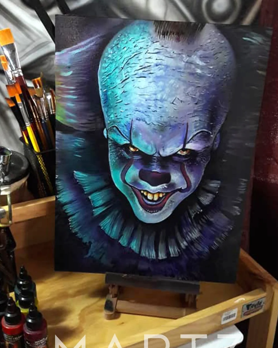
For a horror tattoo, the face has to work before the smoke goes around it. Choose the expression and version of the character you want to recognize. Background effects can build the atmosphere once those decisions are clear.
Which reference should lead the design?
Choose one image that establishes the face or pose. Other references can explain lighting, costume or color, but combining several conflicting expressions can make the brief unclear. If a particular film version matters, name it and supply the corresponding image instead of assuming every version looks the same.
William's Pennywise / below the blue is a painting. Its cool-colored face and dark eye areas offer a reference for mood and emphasis. Look at the eyes against the surrounding color, then consider which of those relationships you would want in a tattoo.
What changes when a painting becomes a tattoo idea?
A painting can rely on its rectangular support and surrounding color. A tattoo needs its own boundary and a relationship to the body. Decide what happens at the hair, costume and background edges, and what would remain if decorative effects were reduced.
Ask which features must survive at the intended size: the eyes, smile, head shape or one recognizable prop. If several of those need more room, changing the scale may be more useful than squeezing in every effect from the reference.
Does a horror piece need a dark background?
Not always. A dark background can frame a pale face, but open skin or a contained shape can also establish separation. The choice depends on the design around the character and any neighboring tattoos.
Meet William in Tulsa with the version of the character you want. A clear expression is a better starting point than a folder full of effects.