Mood in a tattoo: what makes an image feel strong or quiet
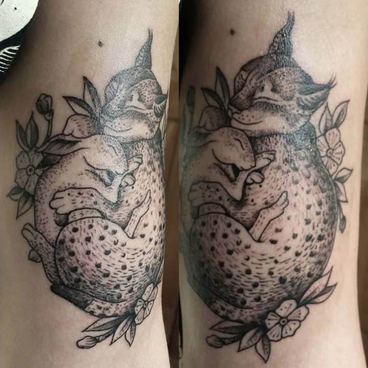
An image can feel forceful because of a face, a sharp change in value or a shape that seems to push beyond its edges. Quietness can come from a lowered gaze, an enclosing curve or the space around a subject. Mood emerges from those relationships. The name of the subject gives only part of the picture.
In my tattoo work in Tulsa, I am interested in the difference between what an image depicts and how it feels to look at it. A skull can be still or restless. An animal can seem confrontational or withdrawn. Color, gesture and contrast give a familiar subject its particular presence.
Darkness has more than one meaning
“Dark” might describe a subject associated with mortality, or simply a large amount of deep shading. Those qualities can occur together, but they do different visual work. A subject carries associations; a pattern of light and dark directs attention within the image.
My skull-and-flames cover-up brings those meanings into a bright palette. Yellow, orange and red fire surrounds the skull. Deep eye sockets and the dark nasal cavity hold the face together, while the flames turn outward around it. The subject belongs comfortably in a discussion of dark imagery, yet much of its energy comes from luminous color.
To my eye, the difference between the stable bone structure and the moving fire gives the piece its tension. The darkest passages anchor it. The brighter edges make the surrounding movement more apparent. Describing everything simply as “dark” would miss that exchange.
Gesture can give an image presence without size
The gesture of a figure begins with the direction of its larger shapes. A curled body gathers attention inward. A lifted head or an outward-reaching form creates a different encounter. Scale changes how much of the body a tattoo occupies, but gesture supplies another kind of presence.
In Fox & foliage, the sleeping fox curls among leaves and small flowers. Fine black lines and dotted shading give the fur and foliage texture. The enclosed pose is what makes the image feel quiet to me: the parts seem to gather around the resting animal rather than pull away from it.
That reading does not depend on knowing the tattoo's exact measurements. The photograph shows a relationship between pose and surrounding forms. A larger version of a quiet gesture would still begin with that same inward movement, even though its relationship to the body would change.
Color can have a quiet gesture
The Orchid tattoo uses pink petals, green leaves and a curved stem, with open spaces between the forms. Its color makes the flower distinct, while the slender movement of the stem gives it a different rhythm from the skull's surrounding flames.
Both pieces use color. Their emotional register comes from what the colored shapes are doing. The orchid's curve offers continuity without the repeated outward turns of the fire. To me, that makes it feel more measured. Quietness does not require removing every vivid passage; it can come from the pace of the drawing.
Mood remains an interpretation
A viewer may experience these images differently, and the wearer's private meaning may differ again. The photographs cannot establish either person's feelings. What I can discuss is the visible language: enclosing or outward shapes, sharp or gradual contrasts, and the movement between areas of color.
That language connects the subjects across my tattoo portfolio. A flower and a skull may have little in common as symbols, yet comparing their gestures reveals something about how images acquire a mood. My work across tattooing and painting gives those relationships room to take different forms.