When a name stops reading as a name
A name tattoo is both a word and a drawing. We read the word quickly because its strokes, spaces and repeated heights form a familiar pattern. When the aim is to replace it, that pattern becomes part of the design problem. Concealing an individual line matters, but so does interrupting the rhythm that makes the whole word recognizable.
For a name tattoo cover-up in Tulsa, the first artistic question is therefore more precise than “What can go over this?” It is: which parts of the lettering carry the most visual weight, and what new structure could occupy that space convincingly?
The spaces belong to the problem too
Lettering includes stems, loops, crossbars and gaps. A fine script can have long sweeping extensions beyond the letters themselves. A compact block word can concentrate dark areas in one horizontal band. Two names containing the same number of letters may occupy very different shapes.
Imagine a broad initial followed by smaller letters. Centering a perfectly symmetrical new motif over the word may put its focal point in an awkward place. Letting the composition shift, turn or extend could create a different relationship. This is a drawing example, not a guarantee about a particular name or style.
The blank areas between letters also deserve attention. They determine how closely the old strokes sit together and where a proposed design has room to change direction. Looking only at the darkest mark misses the pattern surrounding it.
A documented transformation from lettering
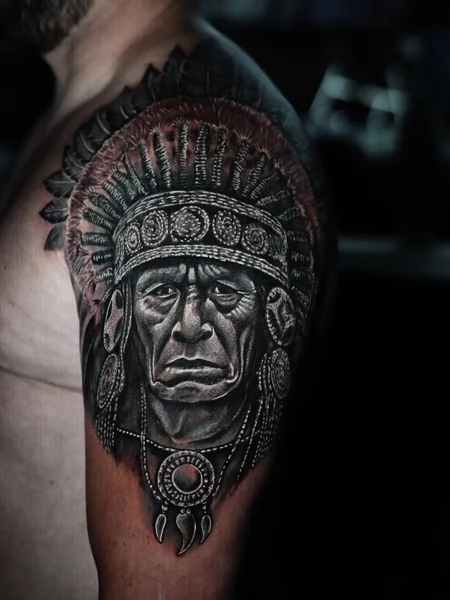
The earlier photograph in Strength & continuity shows bold dark lettering on an upper arm. The finished work replaces that reading with a portrait, feathered headdress and detailed ornament. The photograph does not establish that the original lettering was somebody’s name; its relevance here is the visible geometry of substantial letterforms.
The new design extends beyond their compact arrangement. Repeated decorative bands and feather shapes create new rhythms around a recognizable face. It is possible to compare the old and new silhouettes directly, rather than imagine that a face was simply placed inside the original lettering’s outline.
This is an individual portrait-led solution, not a recommendation that every name should become a portrait. William’s existing article on portraits used in cover-ups explains why facial features leave limited freedom for arbitrary shadows.
Choose what deserves the new attention
A floral arrangement, animal, ornamental form or another subject might create useful directions in a drawing. Choosing among them should involve more than their ability to interrupt letters. The replacement will become the image you see every day, so its subject and mood deserve serious consideration.
You can discuss what you want from the new tattoo without providing a personal explanation for the old name. For design purposes, its shape, placement and your preferences are useful starting points. Wanting a change is enough to begin that conversation.
Let the new silhouette have its own purpose
An outline built only to hug the old word can remain trapped by its shape. Extending upward, wrapping slightly around the limb or introducing a different focal point may give the new image a more natural presence. Whether those changes suit a particular tattoo requires individual assessment.
Explore William Martz’s cover-up portfolio alongside his background as a Tulsa artist. The lettering transformation offers a concrete lesson: a convincing replacement gives the eye a new way to organize the image. It makes the next subject worth seeing, rather than leaving the old word in charge of the composition.