Matching tattoos in Tulsa: a shared idea with room for individuality
Matching tattoos can share an identical image, but they can also share a visual language. A subject, a curve, a color or a small recurring detail may be enough to connect two pieces. I find the most interesting question is what should remain shared and where each person wants their own interpretation.
There is no need to rank those approaches. Exact repetition can be the point. So can a relationship between two different images. For matching tattoos in Tulsa, I would start with the connection people want to carry, then consider the kind of composition that expresses it clearly.
Identical images and related images do different things
An identical motif makes the connection immediately visible when the tattoos are seen together. A related pair can ask the viewer to look a little longer. Neither needs a complicated explanation to be worthwhile.
Imagine a shared botanical subject drawn with a different curve for each placement, or two animals treated with the same palette. These are design possibilities, not accounts of particular clients. The important distinction is that the relationship can exist at several levels: subject, shape, style or color.
Trying to share every one of those qualities may be unnecessary. Choosing one or two gives each drawing room to develop without losing the connection.
One subject can hold very different personalities
Two independent pieces in my portfolio illustrate this range. Red butterfly uses red wings with dark edges and small pale markings. Its diagonal position near the wrist gives the image a clear direction, with open skin around the silhouette.
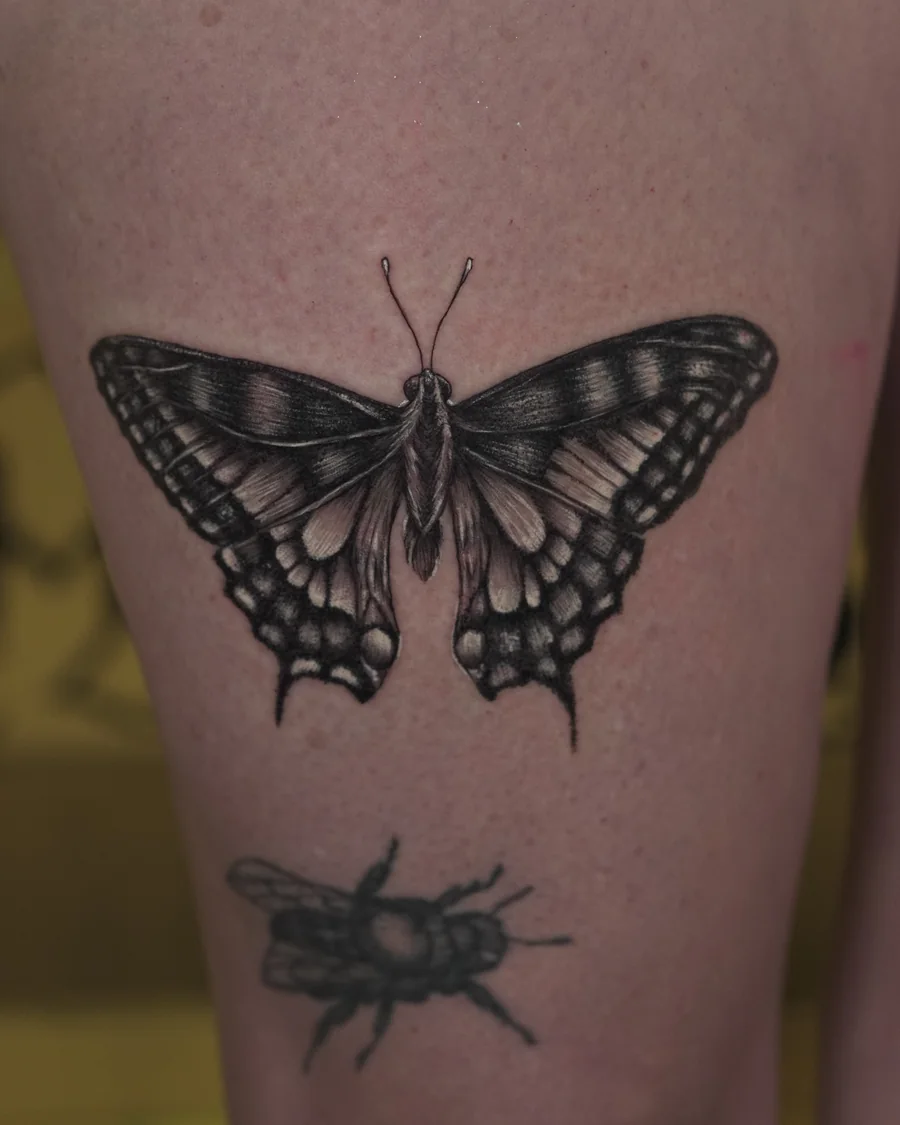
Butterfly study treats the same broad subject in black and grey. Spread wings, fine internal lines and alternating light and dark areas give the image its structure. The subject is related, but the proportions, palette and visual energy are different.
These are separate portfolio works, not a documented matching commission. I bring them together here because they make a design possibility easy to see: sharing a subject does not force two people to wear the same expression of it. One person might connect with red wings and a diagonal gesture; another might prefer the tonal relationships of black and grey.
Each tattoo has a life away from the pair
Most of the time, a matching tattoo will be seen on its own. I think that is worth respecting in the drawing. It can have a connection to another piece while still feeling complete on the person who wears it.
A divided image is one option, especially when the experience of bringing the parts together matters. A complete image with a shared detail is another. The choice changes how the tattoo reads when its companion is absent from view.
For my taste, a clear individual silhouette helps a design keep its presence. The private connection can add another layer without having to do all the visual work.
Placement allows variation without losing the connection
Different placements can ask for different proportions. A shape that feels balanced in one area may need a different curve or more open space elsewhere. Exact dimensions do not have to be the thing that makes a pair belong together.
This is also where differences in taste can become useful. A shared line rhythm might connect a black and grey tattoo with a color piece. A recognizable subject might remain consistent while its surrounding elements change.
What I want from that kind of design is a connection that feels chosen, with enough room for both people to recognize themselves in the result. The tattoos can speak to each other without asking either person to disappear into the pair.
Read about William Martz and my tattoo work in Tulsa to see the artistic range behind these possibilities.